ECT Hosted Store > How to get started with the Hosted ECT Store
Log into your store admin and go to the Store Design page where you will find the following options for setting up your design choices and content...
There are a number of themes to choose from and you can select the one here that best suits your design needs. You can switch theme at any time and your settings, such as products you have added or content pages will stay intact - only the design framework will change.
All the elements in the header section are editable here. You'll see a default logo has been provided but that should be replaced by your own. Think carefully about your logo image, you may want to use a PNG file with a transparent background so it blends into the header section. Also think about the width and height so the image doesn't force your header to be too "high". You can of course test with different versions until you get the one you are happy with.
The Main Top Menu is the principal navigation bar. We would suggest a maximum of eight to ten links there.
The Secondary Top Menu resides the top left of the header and is ideal for two to three links, possibly links to the account page, tracking and / or order status page.
The Design Tweaks here only corresponds to the header section of the layout. Use the color picker to choose the colors for the links, borders and backgrounds. If you want to keep the default settings you can ignore this section.
This is where you can choose the elements you want to appear in the left hand sidebar as well as providing your own colors.
You have a choice for the main left hand menu, the options include using the accordion menu, which like the pop-out menu, is dynamically populated by the categories and sub-categories you add through the admin categories page. The accordion menu will drop down to show the sub-categories whilst the pop-out menu will show them to the right of the main categories. You could also create your own custom menu where you will have to enter the link text and link location manually. These will appear in a simple styled list.
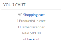
The left mini cart will show a summary of the shopping cart contents, estimated shipping costs and applicable discounts as well as providing a link to the shopping cart itself. Select "No left mini cart" if you don't want to display this feature in the sidebar.
The left links menu allows you to offer a secondary left hand menu. These may be links to store pages like the gift certificate, donation or affiliate page. It can also be used to link to your own non-store based pages you have set up or will set up through the "Body Content" section.
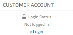
If you are using the customer account feature you may want to display a login box in the left hand sidebar. The customer account and its settings can be turned on via the admin parameters page and this widget will show the login status with the ability to log in or log out as well as providing a link to the customer's account.
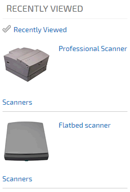
The Recently Viewed Widget can be enabled and will appear in the left hand side bar on the product detail pages once a customer has visited more than one detail page. It will provide a product image, product link and category link to the products they have viewed. They can also click on the top "recently viewed" link which will display a list of all the recently viewed products on one page.
The Contact section will appear at the bottom of the left hand side bar. You would need to enter your own contact details but if you prefer not to display this section, remove the default content. Using it as a Contact section is only a suggestion and you could of course use it for other purposes and display other content.
Finally you have the option to select the colors for the sidebar text color, heading text and background. The background you choose will also be used as the background color for the footer section.
The Body Content Region is where you can define the layouts of the product and detail pages as well as confectioning the optional cross selling and quick buy features. It is also the place where you can set up the non-store generated pages, like your home page, about page or any other non-store content.
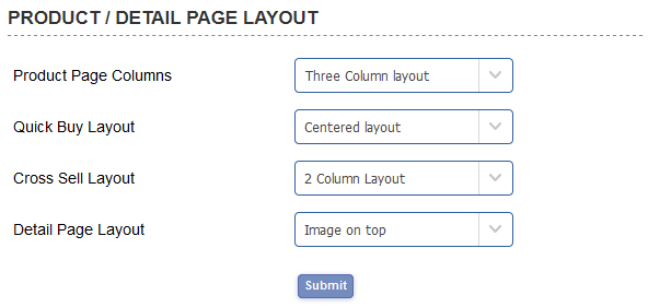
Select if you would like to display your products on the product page in two or three columns. You may want to experiment with this and the other related settings to get the look you are after.
The Quick Buy feature is optional and can be added to your products page under Page Elements > Product Page. It means that customers can see more information about the product and add to cart without having to go to the product or detail page itself. The display will be in a pop-up window and you can define the elements you want to appear here and if you want the elements centered or image to the left and details to the right.
The Cross Sell feature is also optional and if you choose to do so in the admin parameters page it can appear on the home page and / or the cart page. This is where you can define how many columns of cross selling items you want to appear on either.
There are two options for the display of the product detail page, you can have the image at the top of the page with the elements below - this lends itself well to display larger images, or the image the left and elements to the right / below the image which is more suited to smaller product images.
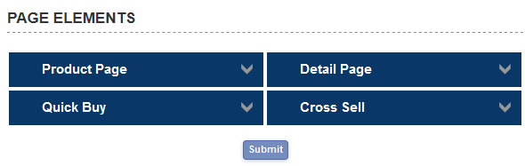
Under Page Elements you can select which elements should appear on each of the screens as well as defining the order on the page. Use the up arrow to define position and the checkbox to display the element. If you choose to show one or more custom fields they can be populated in the product admin page and you can set a label for these as well as the SKU, manufacturer and date added in the admin parameters page.
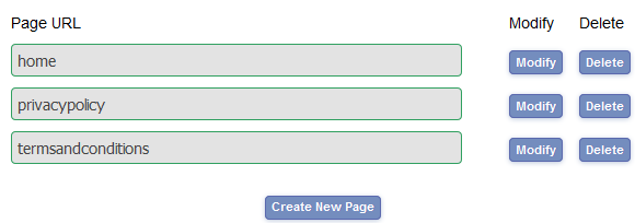
The final section is the Body Content and this is where you can set up your non-store pages. There are some default pages we have defined but which you will have to add your own content to. The home page, your privacy page and the terms and conditions. This last page will appear in a pop-up window to be agreed to on checkout. It's an optional feature that can be turned on or off in the admin parameters page. You can create as many non-store pages as you like and we have compiled some specific help on setting those up on our help page.
The Footer section resides at the bottom of the page and is divided up into four main columns.
The first section is the main footer menu and you have a choice here of what type of contents you would like to display in the menu. You can choose to show a list (with links) of your top ten best sellers, your top ten most popular products (calculated by product detail page visits) or you can choose to set up your own menu links.
The Footer About section is typically used to write a few lines about your company and / or product line. You could however use it for other purposes like showing third party trust seals.
The Footer Help section is ideal for placing contact information, help links, telephone number but again you can choose the content of your choice.
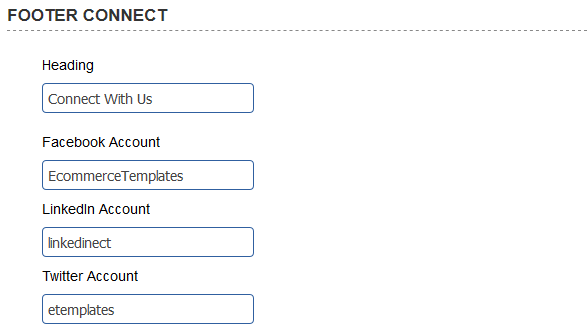
The last section is devoted to social media icons. To enable an icon, enter the name of your account for each you want to display. For example if the URL of your Facebook page is https://www.facebook.com/EcommerceTemplates/ you would enter EcommerceTemplates in the Facebook field if you twitter page is at https://twitter.com/etemplates you would enter etemplates in the twitter field to enable the icon and link.
Below those four columns you can enter your copyright notice and right at the bottom, links that would typically go to your terms and privacy pages.
Finally you can define the color of the links in the footer via the color picker. Remember the footer background color is set in the left navigation section as it shares the same value.

