Contact sales now: info@ecommercetemplates.com
Ecommerce Templates > Responsive design
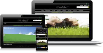
We can no longer assume that visitors will be viewing your store on their desktop computer. They may be using their tablet, smartphone, laptop or whatever device yet to hit the mass market. They may also not have their browser maximized in whichever device they are using.
Designing separate sites for separate devices would be cumbersome and to be honest quite impossible as the number of combinations of available screen sizes would be massive.
Through the css file we use something called media queries, which is basically assigning different css rules depending on the browser window size. A simple way of thinking about it, and indeed used in the planning process, is to drag your browser window to make it smaller and seeing where the design breaks down. At each point where the design breaks we set up a new set of css rules – these are called “breakpoints”.
With smaller browser window sizes it may be necessary to hide some elements, use different background images and resize others so we change the css at each of the breakpoints.
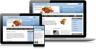
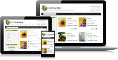
The only difference between the Responsive Design layouts and the other Ecommerce Templates is the css file. You would set up your store in the same way as you would any of the others.
The shopping cart software behind it is identical so you can follow our tutorials and help files to upload your site to the server, make the database connection and start adding products.
The initial purchase comes with six months of support, straight from the developers on our support forum, so if you have any questions about the set up, there's always someone on hand to point you in the right direction.
Remember that all the graphics, colors and text in the designs are editable, making for a highly flexible and powerful platform for your new online store. You can also edit the design in the editor of your choice, whether that be a dedicated HTML editor like Dreamweaver or Expression Web or a text editor like Notepad ++.
Our responsive designs with Ecommerce Templates shopping cart software integrated are available in ASP and PHP versions. The price is a one time fee of $229 and comes with six months of support and six months of updates as we release new features.
If you are already using Ecommerce Templates shopping cart software but want to switch to a Responsive Design, we have a Replacement Service available.
This will provide you with the full version of the shopping cart software integrated into a Responsive Design.
If you have any questions about that switch, please get in touch.

 Login Status