Contact sales now: info@ecommercetemplates.com
Ecommerce Templates > General Help > Mobile friendly shopping cart
If you want to set up a mobile friendly store we recommend you take a look at our Responsive Designs that adapt to browser width, screen size and orientation.
If you prefer not to work from a responsive design, we have added some extra mobile friendly features to Ecommerce Templates. The main feature is that the software will detect a mobile user and change the billing and shipping cart page to a one column layout. For some users this may well suffice and no other action or integration is necessary, however if you are serious about giving mobile users an enhanced browsing experience we have created this help file to explain how to set up a mobile friendly store.
The first thing you will need to do is set up the mobile directory on your server. You can call it what you like but keep it short like /mob/ or /mobile/.
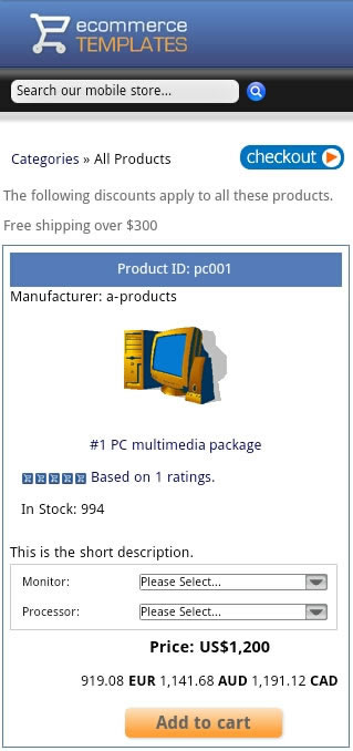
You can have as many pages as you like in the mobile folder but the minimum requirement would be an index page cart page, categories page, products page, product detail page and css file. You can't simply copy your existing files as they will be too wide so it will be necessary to set up new ones.
First of all make a copy of your vsadmin folder and upload that to your mobile folder.
Open a blank page in your HTML editor with the following in code view
<!DOCTYPE html PUBLIC "-//WAPFORUM//DTD XHTML Mobile 1.2//EN" "http://www.openmobilealliance.org/tech/DTD/xhtml-mobile12.dtd">
<html xmlns="http://www.w3.org/1999/xhtml">
<head>
<meta http-equiv="Content-Type" content="text/html; charset=iso-8859-1" />
<title>Mobile site</title>
<meta name="viewport" content="width=device-width, initial-scale=1, maximum-scale=1">
<meta name="HandheldFriendly" content="true" />
<script type="text/javascript" src="/js/ectcart.js"></script>
<link href="/css/ectcart.css" rel="stylesheet" type="text/css">
<link href="style.css" rel="stylesheet" type="text/css" />
</head>
<body>
<div> xxx content goes here xxx</div>
</body>
</html>
and save as blank.html
Save blank.html as products.asp or products.php depending on which version you are using. For the ASP version replace
xxx content goes here xxx....
with
<!--#include file="vsadmin/db_conn_open.asp"-->
<!--#include file="vsadmin/inc/languagefile.asp"-->
<!--#include file="vsadmin/includes.asp"-->
<!--#include file="vsadmin/inc/incfunctions.asp"-->
<!--#include file="vsadmin/inc/incproducts.asp"-->
For the PHP version that would be
<?php include "vsadmin/db_conn_open.php" ?>
<?php include "vsadmin/inc/languagefile.php" ?>
<?php include "vsadmin/includes.php" ?>
<?php include "vsadmin/inc/incfunctions.php" ?>
<?php include "vsadmin/inc/incproducts.php" ?>
Also for the PHP version you will need to add the following code right at the top of the page before doctype declaration, with no spaces before or after...
<?php
session_cache_limiter('none');
session_start();
ob_start(); ?>
Check the page on your mobile device before continuing. Do the same for detail, categories and cart pages below.
For the ASP version, save products.asp as proddetail.asp and change the last ASP include line from
<!--#include file="vsadmin/inc/incproducts.asp"-->
to
<!--#include file="vsadmin/inc/incproddetail.asp"-->
For the PHP version, save products.php as proddetail.php and change the last PHP include line from
<?php include "vsadmin/inc/incproducts.php" ?>
to
<?php include "vsadmin/inc/incproddetail.php" ?>
For the ASP version, save products.asp as categories.asp and change the last ASP include line from
<!--#include file="vsadmin/inc/incproducts.asp"-->
to
<!--#include file="vsadmin/inc/inccategories.asp"-->
For the PHP version, save products.php as categories.php and change the last PHP include line from
<?php include "vsadmin/inc/incproducts.php" ?>
to
<?php include "vsadmin/inc/inccategories.php" ?>
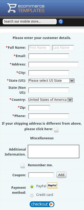
For the ASP version, save products.asp as cart.asp and change the last ASP include line from
<!--#include file="vsadmin/inc/incproducts.asp"-->
to
<!--#include file="vsadmin/inc/inccart.asp"-->
For the PHP version, save products.php as cart.php and change the last PHP include line from
<?php include "vsadmin/inc/incproducts.php" ?>
to
<?php include "vsadmin/inc/inccart.php" ?>
At this point it's probably a good idea to test the mobile site, adding a product to cart and making sure everything is working as it should. You may decide to change some of the text entries in languagefile.asp / .php for example (move those to vsadmin/includes.asp / .php so they don't get overwritten by updaters).
You should now have the bare bones of the store pages. You will probably want to add a header section to include your logo, horizontal navigation bar and possibly the search field.
Remember that the available width of a typical handheld device is 320 pixels so bear that in mind when adding these elements. The header and footer section would normally be made up of two separate divs before and after the ASP / PHP include lines.
We recommend using the css layouts feature for formatting the content of the store pages. We have a sample css file available from our downloads page that can be used as a starting point. You can of course start from scratch with our css layout help page.
The simple way of doing this is to include a regular text link on your main site pointing to the mobile version. If you prefer you can set up a redirect so that if a mobile user visits the site, they will automatically be forwarded to the mobile version.
There are many scripts available for redirection, and you'll have to decide if you want to treat tablets differently from smartphones .Here's a simple javascript solution that can go on your main site. This snippet needs to go at the top of your code.
<script type="text/javascript">
<!--
if (screen.width <= 699) {
document.location = "/mobile/";
}
//-->
</script>
... where /mobile/ is the location of your mobile version.